Lexington Law Design System
Establishing a foundational design system as the company's sole product designer, unifying visual language across design, marketing, and engineering.
Year:
2023
Timeframe:
12 weeks
Tools:
Figma, ChatGPT
Category:
Design Systems
01 • Overview
Context
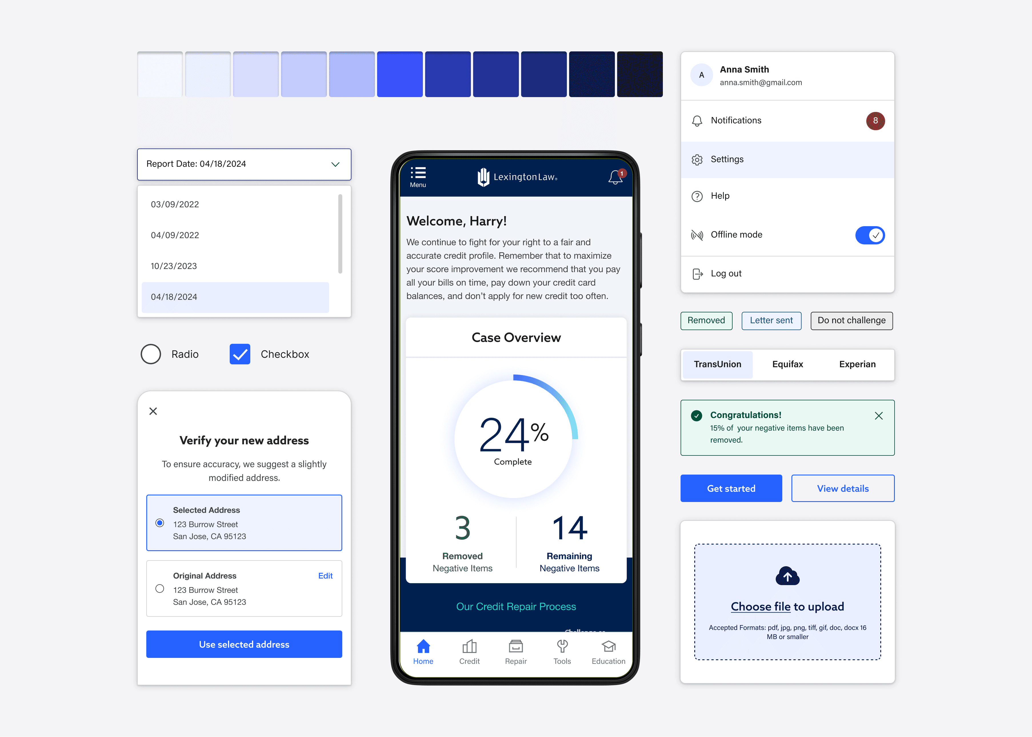
As the sole Product Designer at Lexington Law, I initiated and led the company's first design system — a shared set of standards for typography, color, iconography, and component behavior. The goal was to give designers, developers, project managers, and marketing stakeholders a single visual language to work from, replacing years of ad hoc styling decisions with a governed, scalable foundation.
The Challenge
Lexington Law had grown without a set of shared design standards. An existing brand book covered high-level identity — logo, color palette, tone — but left real gaps in interaction design and accessibility, leading to inconsistency across the product and slower handoff between design and engineering.
How might we build a design system that's genuinely feasible for engineering to implement, while giving Marketing and Design a shared visual language that holds up across a fast-moving fintech product?


02 • Approach
Research + Insights
I began with a full audit of the live product and internal documentation, comparing what had actually shipped against the brand book. The most urgent gap I uncovered was accessibility: our primary button color failed WCAG 2.2 AA contrast requirements. I met weekly with Marketing's brand owners to rework the color system in a way that preserved brand identity while meeting compliance standards.
Ideation + Iteration
To make sure the system would actually get adopted, I worked weekly with two engineers to audit redundant styles and align tokens between Figma and our Bootstrap codebase. I structured the system atomically, starting with the smallest building blocks — color, type, spacing — before layering up to components and templates, with scalability across teams as the guiding priority.
A key piece of that scalability was naming: I used ChatGPT to help pressure-test and optimize a naming convention for both primitive and semantic token layers, landing on a consistent element.tone.emphasis.state structure that stayed legible as the library grew. Working alongside Marketing, I resolved inconsistencies in body font and weight usage, defined clear visual rules distinguishing interactive elements from informational ones, and rebuilt our primary button color for stronger contrast. The library ultimately expanded to include typography tokens, an icon sheet, and fully specified inputs and selects with defined states and behaviors.


03 • Validation
Testing + Feedback
I ran the final system through Stark to confirm WCAG 2.2 AA compliance across delivered screens. Testing surfaced one contrast issue on a hover state, which I corrected before rollout.
To close the loop with Engineering, I documented the full system in Figma with dev-ready specs and redlines, then walked the team through it directly in pairing sessions rather than handing off a static file. That process surfaced a handful of additional inconsistencies engineering caught while implementing against the new specs, which we resolved together before rollout. Once live, developers confirmed the documented tokens and components measurably sped up implementation — validating that the system wasn't just visually consistent, but actually built to be used.


04 • Reflection
Key Outcomes
The design system was adopted across Design, Marketing, and Engineering, replacing inconsistent, undocumented styling with a governed, accessible foundation that sped up both design and development cycles.
8%
INCREASE
in CTA click-through rate on landing pages
50%
REDUCTION
in design time
✨
COMPANY-WIDE ADOPTION
across marketing, design, and engineering teams
Next Steps
With the foundation in place, the next phase is expanding the system to cover custom, in-house components specific to a credit repair product — bureau status toggles, dispute data tables, and similar fintech-specific patterns not covered by generic UI libraries. Longer-term, I'm interested in exploring a multi-brand theming architecture that would let designers switch a design between brands with a single token swap, rather than rebuilding it from scratch.


